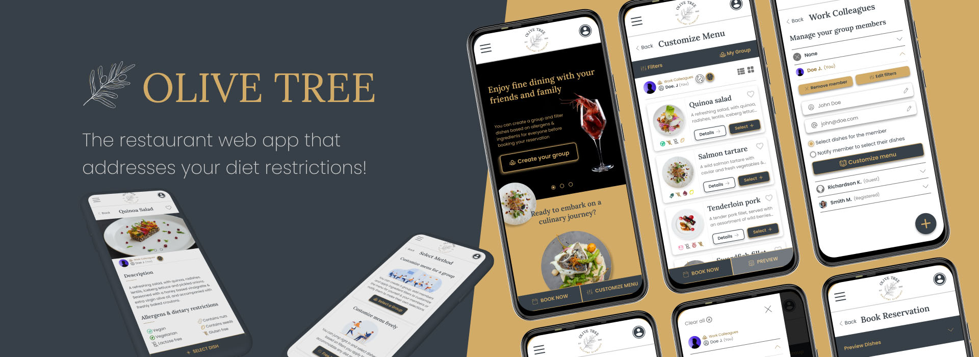
Olive Tree Restaurant Mobile Web App
Olive Tree Restaurant Mobile Web App
PROJECT: Olive Tree
ROLE: UX Designer - UX Researcher
Duration: June 2022 - April 2023 i
Project Overview
The Product
Olive Tree is a fancy restaurant, located in the center of a metropolitan city. Olive Tree offers creative, gourmet dishes, containing only premium organic ingredients. Olive Tree targets customers that are busy working adults who enjoy fine dining with their family , a social or a work group. The MVP for this product was developed as a mobile web based application, rather than being a native app, to showcase my mobile web design skillset
The Problem
Busy working adults lack the time to directly contact restaurants & "screen" dishes for allergies or diet restrictions before booking a reservation
The Goal
Design a web app for Olive Tree that allows users to pre-select dishes for a group based on allergen/ingredient filters and book a reservation easily & quickly.
The Design Process
For this project, I took a user-centered approach, using the Design Thinking UX framework, that proved very effective in my design process. I used various design methods, consisting of conducting interviews, creating personas, building user stories and user journey maps, compiling competitive audits, paper & digital wireframing, creating mockups, low & high-fidelity prototyping, conducting usability studies, accounting for accessibility, and iterating on designs.
Understanding the User
Summary
I conducted interviews and created empathy maps to understand the users I am designing for and their needs & aspirations. A primary group identified through research, was working adults with families, having busy schedules and limited time to search online for restaurants.
This user group confirmed initial assumptions about the Olive Tree restaurant customers, but research also revealed that time was not the only factor limiting users from selecting and booking a restaurant. Other user problems included dietary restrictions and strong personal preferences that make it difficult to make an informed decision of the dish selections best fitting their needs.
Pain Points

Time
Working adults are too busy to spend much time browsing restaurant web apps and online reviews.

Support
Restaurant web apps lack information over food allergens and ingredients of dishes.

Process
Users with dietary restrictions struggle to select a restaurant that addresses their needs.
Personas

Primary
Name: Naomi Johnson
Age: 45
Education: Doctor of Medicine (M.D.)
Hometown: Southborough, Boston
Family: Married, with one child
Occupation: Doctor
Naomi is a doctor with a busy and demanding schedule. She works in the emergency department of the Boston Central Hospital and raises her four year old son with her husband. Naomi and her family often dine out in fancy restaurants, booking online their reservations in advance. But she finds it difficult and time consuming to pick a restaurant that accommodates her particular food preferences and most importantly, the diet restrictions of her son, who has a severe allergy to nuts. Naomi hates worrying for her son's safety, instead of relaxing and enjoying a nice evening out.
Goals
- To care for her patients.
- To spend time with her family and keep her son safe.
- To be able to relax on her personal time.
Frustrations
- "Lack of information over food allergens & ingredients list on restaurant websites."
- "I would love to research online and find the perfect restaurant, but I simply don't have enough time."
Personal Motto: "Having a busy and demanding schedule, I need to be able to relax outside of work."

Secondary
Name: James Mollins
Age: 31
Education: Master's degree
Hometown: Chicago, Illinois
Family: Single, lives alone
Occupation: Senior lawyer
James is a senior associate in a major law firm who aspires to become a managing partner, and spends most of their free time honing their skills. James frequently picks and reserves online a fancy restaurant to dine in with a group of colleagues, to enjoy social life and forge strong professional relationships. But having to plan for a diverse group of people is challenging and time consuming. James wishes there was an easy and efficient way to inform his decisions.
Goals
- To level up their skills and get a promotion soon.
- To forge strong professional relationships with colleagues.
- To minimize the planning time and enjoy the nightlife and social life of the city.
Frustrations
- "Browsing websites and online reviews to pick the best spot for a night out is time consuming."
- "It's difficult to pick a restaurant that accommodates everyone's preferences and needs."
Personal Motto: "I strive to shine in my work and cultivate strong relationships with my colleagues."
Competitive Audit Analysis
Competition
We looked at several potential competing restaurants, to compare the restaurant selection process and reservation experience of each competitor's web app
Our key competitors are Hytra, a fine-dining restaurant offering modern cuisine, inspired from traditional recipes and ingredients. Aleria is a fancy restaurant passionately serving and evolving Modern Greek Cuisine.
Dinner In the Sky is a franchise restaurant offering a 6-course menu at 40 meters up in the sky for a unique experience. Our last competitor is Sublimotion, a high-end restaurant offering an imaginative dining experience with VR tech & immersive film projections.
Hytra and Aleria are direct competitors, while Sublimotion and Dinner In the Sky are indirect competitors.
Gaps & Opportunities
We used our findings about our competitors weaknesses & identified some market gaps
- Competitor products don't offer extensive ingredient listing and filtering
- Reservation process isn't greatly integrated, and users often must call the establishments
- Competitor products provide a limited amount of accessibility features
The gaps above allowed us to create a list of opportunities
- Offer customization options that emphasize favorite/hated ingredients and dietary restrictions, accompanied with personalized suggestions
- Create a streamlined process for reservations
- Integrate our app with accessible technology
Starting the Design
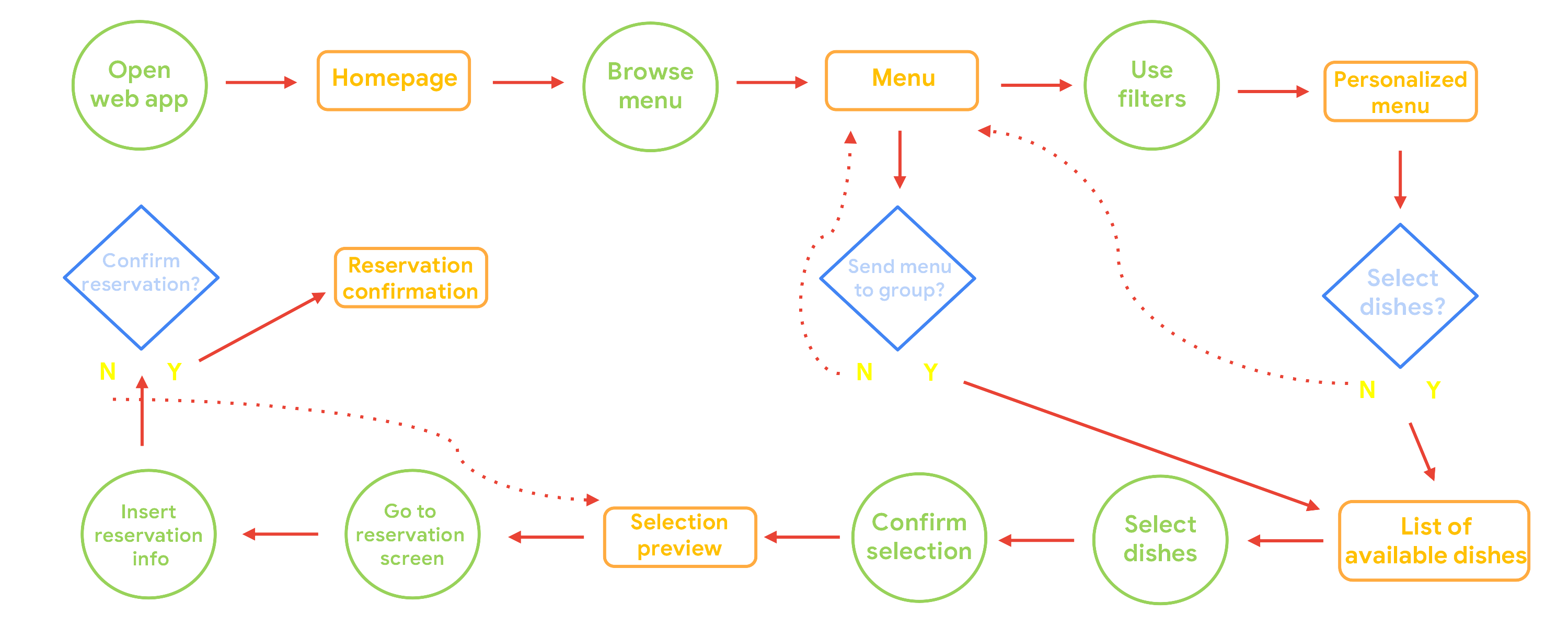
I created a base user flow for the main task, which is to to apply filters & select dishes based on allergies/diet restrictions/ingredients and book a reservation for themselves or a group. The user flow helps us understand how the users can inderact with our product and how they are navigating through the user goals.
Wireframes & Early Prototypes
Paper Wireframes
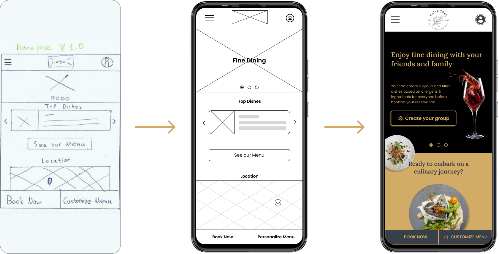
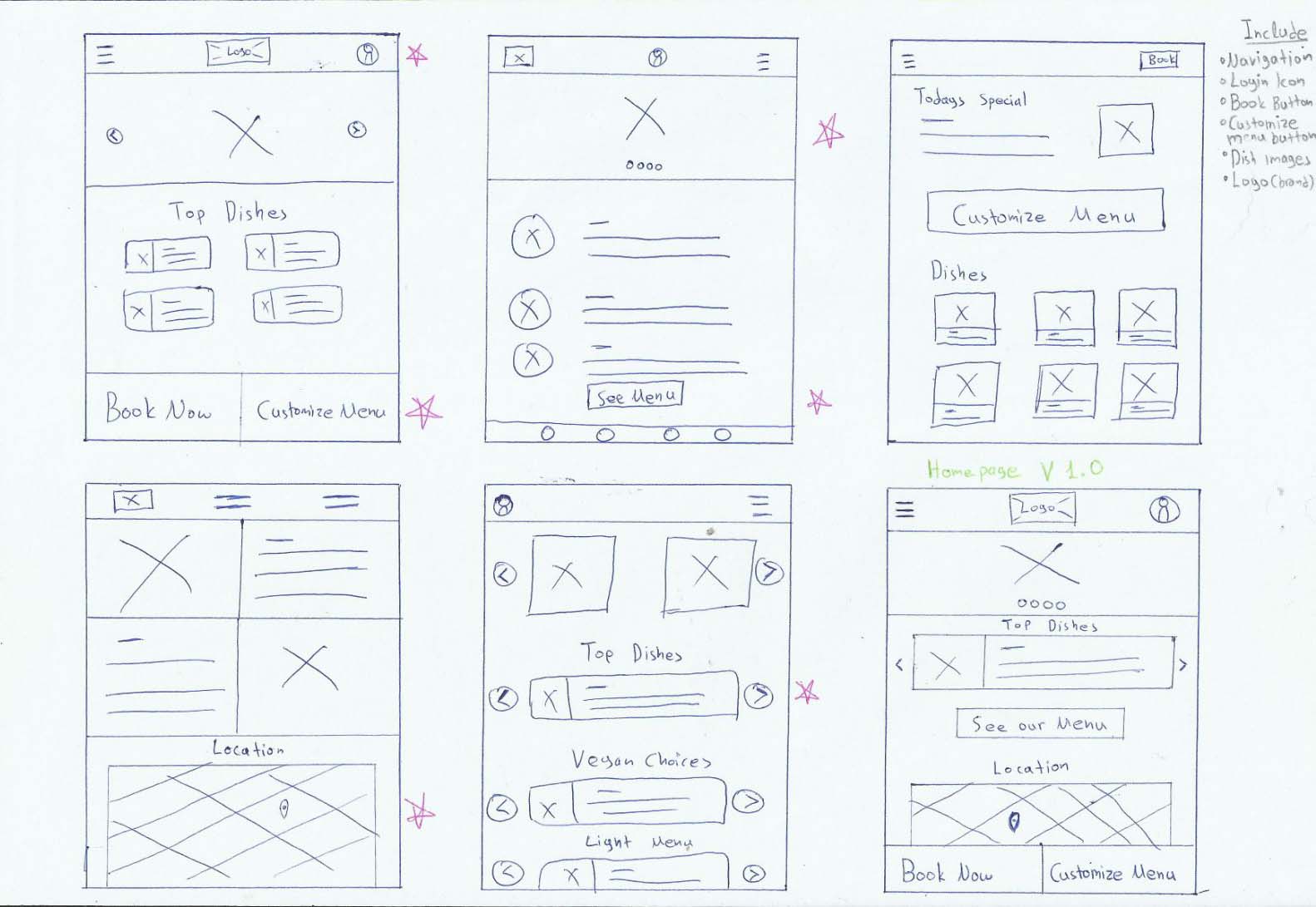
I started sketching some paper wireframes for a cost & time efficient way to create the basic layouts for my designs.
Drafting multiple iterations of each screen on paper, allowed me to ensure the inclusion of the necessary elements needed to address the user's pain points, before translating them into digital wireframes.
Digital Wireframes & Low-fidelity Prototypes
Following initial findings from feedback & user research, I made sure to base the designs on actual user needs, when creating the digital wireframes.
The low-fidelity prototype contained the interactivity needed for the primary user flow of customizing the menu & booking a reservation, so the prototype could be used to conduct a usability study with users.
View the Olive Tree restaurant Low-fidelity prototype.
* The Figma files are locked for safety reasons, feel free to request an invitation to view the content.

Usability Studies
I conducted two rounds of usability studies, one for the low-fidelity prototype and another for the high-fidelity prototype. I identified the key research questions our studies should answer:
Can users customize the menu based on their preferences?
Are there any pain points users experience when customizing the menu for their group?
Are there any challenges users face when booking a reservation?
How long does it take to book a reservation?
Can users complete booking a reservation?
Are there parts of the user flow where users get stuck?
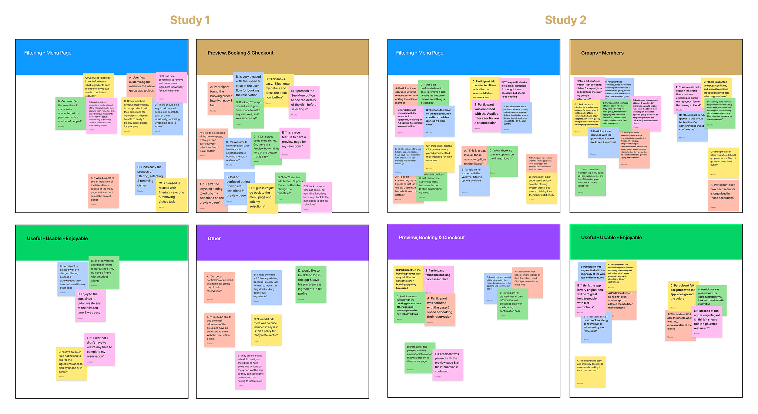
The methodology I followed was having a remote session with each participant, where I acted as the moderator. Each session included an introduction, a list of tasks for the users to complete, and a short questionnaire. The Key Performance Indicators (KPIs) I used to measure my progress to the end goal were: Time on task, User error rates, Conversion rates & a System usability scale (SUS). The data was gathered in spreadsheets & organized using affinity diagrams, to help me identify themes & patterns in an efficient and fun way!
Findings
After completing the usability studies, I analyzed & synthesized the research results to develop the necessary insights. Findings from the first study helped guide the designs from wireframes to mockups. The second study used a high-fidelity prototype and revealed what aspects of the mockups & the user flow needed refining.
Round 1 findings

Almost all users were unsure how to customize the menu for their group, leading to the insight that users need better cues for what steps are required to customize the menu for their group.

For most users it's not immediately clear how to edit their selections from the preview page, leading to the insight that users need better cues for what steps are required to edit their selections.

For most users the filtering process is time consuming, leading to the insight that users need a faster way to filter their dishes.
Round 2 findings

I found that almost all users were unsure on which menu customization flow they were at a given time, leading to the insight that users need a streamlined flow to customize the menu for them or their group.

For many users the selected dish layout was confusing, leading to the insight that users need better cues on the actions & features available on a selected dish.

Most users would prefer a more intuitive way to access their groups, leading to the insight that users need better cues for what steps are required to access their groups or members.
Refining the Design
Iteration 1
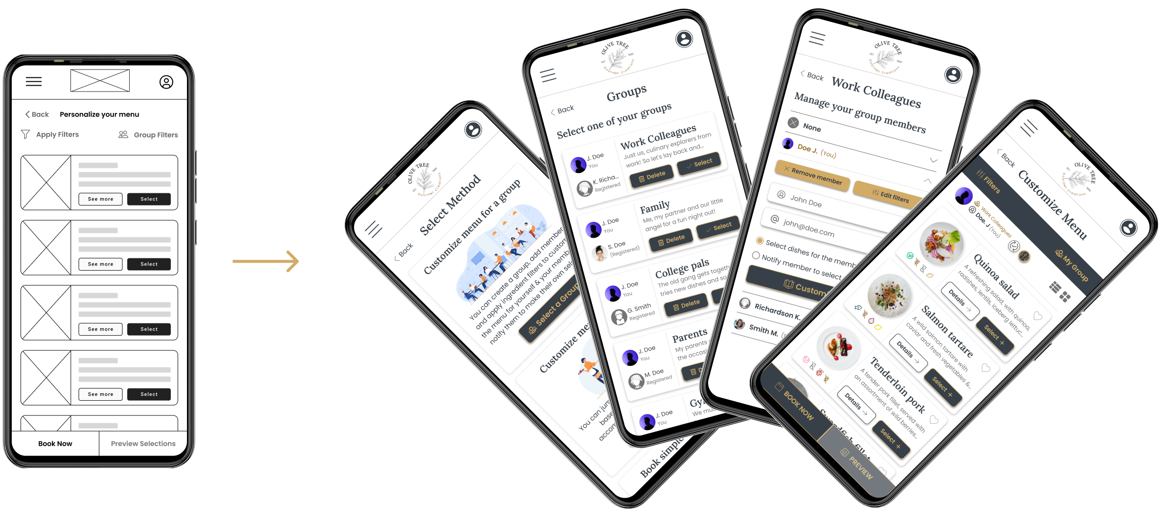
Early designs allowed users to customize the menu for a group, but after the usability studies I added multiple flows & an additional screen where the users can select their desired flow right from the start, for a more streamlined experience. I also revised the design so users would be aware of the selected group & member on all the screens where it's needed. With the optimized designs, users were free to either quick-select dishes by themselves, book a table instantly & order in the restaurant, or select dishes for a group (with the option to notify any member to select their own dishes).
Refining the Design
Iteration 2
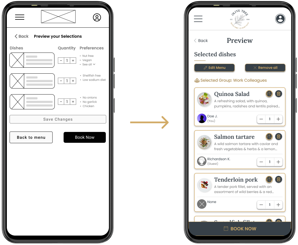
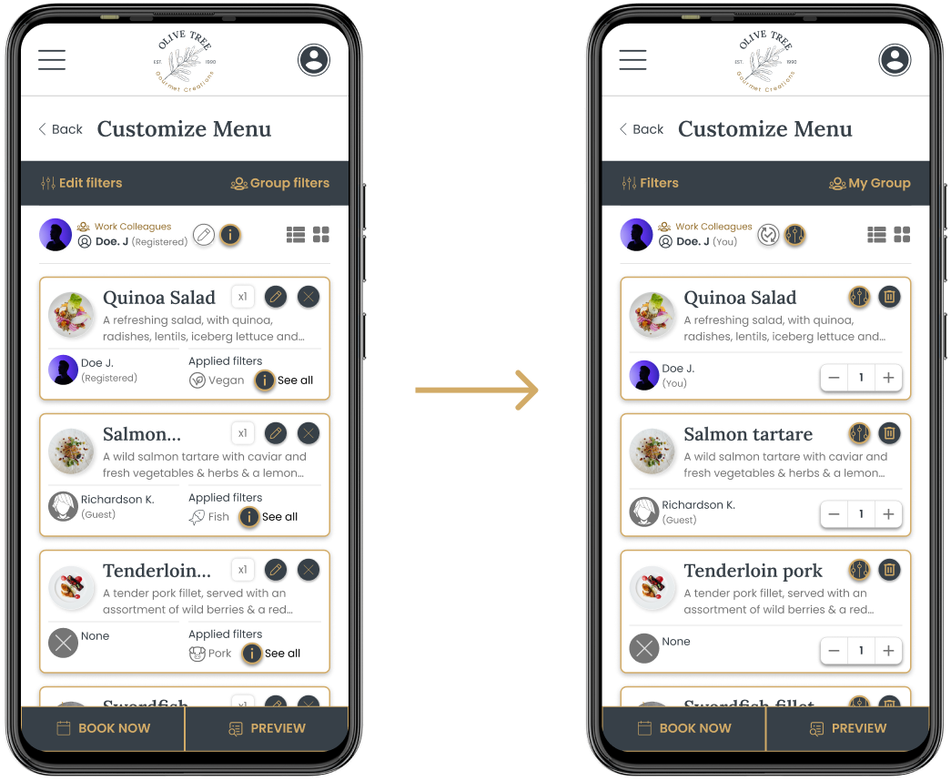
The preview page allowed some customizability to users on initial designs, but usability studies revealed the users' confusion when they tried to edit their selections. The layout was revamped to provide users a more intuitive & visually appealing experience.
Refining the Design
Iteration 3
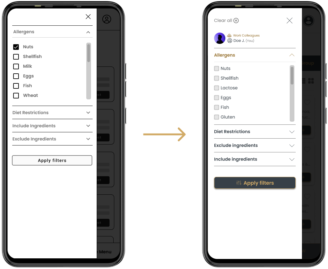
Early designs allowed users to apply filters based on diet restrictions or preferences, but usability studies suggested users found the process long & tedious. I modified the design, so users could remove all filters with one click. I also included an indication of the member the filters apply to, so users would avoid any unnecessary confusion.
Refining the Design
Iteration 4
The second usability study revealed the users' confusion with the selected dishes layout & the available actions within it. I revised the design, so the layout and actions were more clear & intuitive. I also modified the iconography, so it would be universally understood by most users & clickable icons would better represent their actions.
Finalizing the Design
High-fidelity Prototype
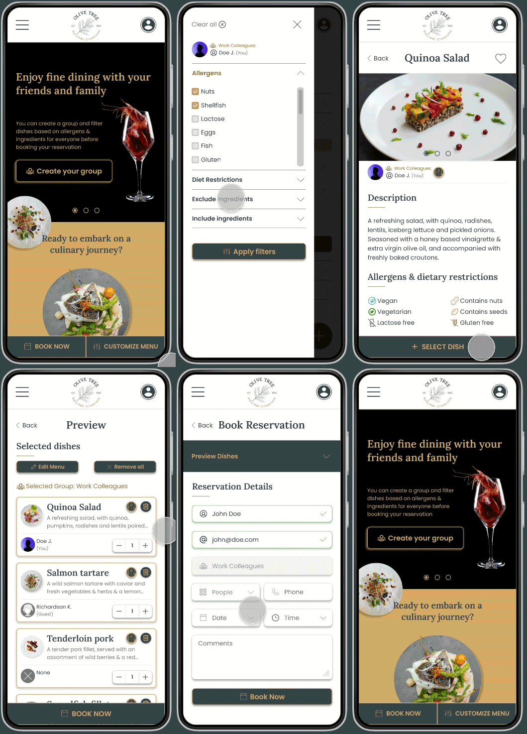
The high fidelity prototype offered clear user flows for selecting dishes & booking a reservation for groups or individually. It also met user needs for filtering dishes based on allergies & dietary restrictions.
View the Olive Tree restaurant High-fidelity prototype.
* The Figma files are locked for safety reasons, feel free to request an invitation to view the content.

Design System
Visual Styles
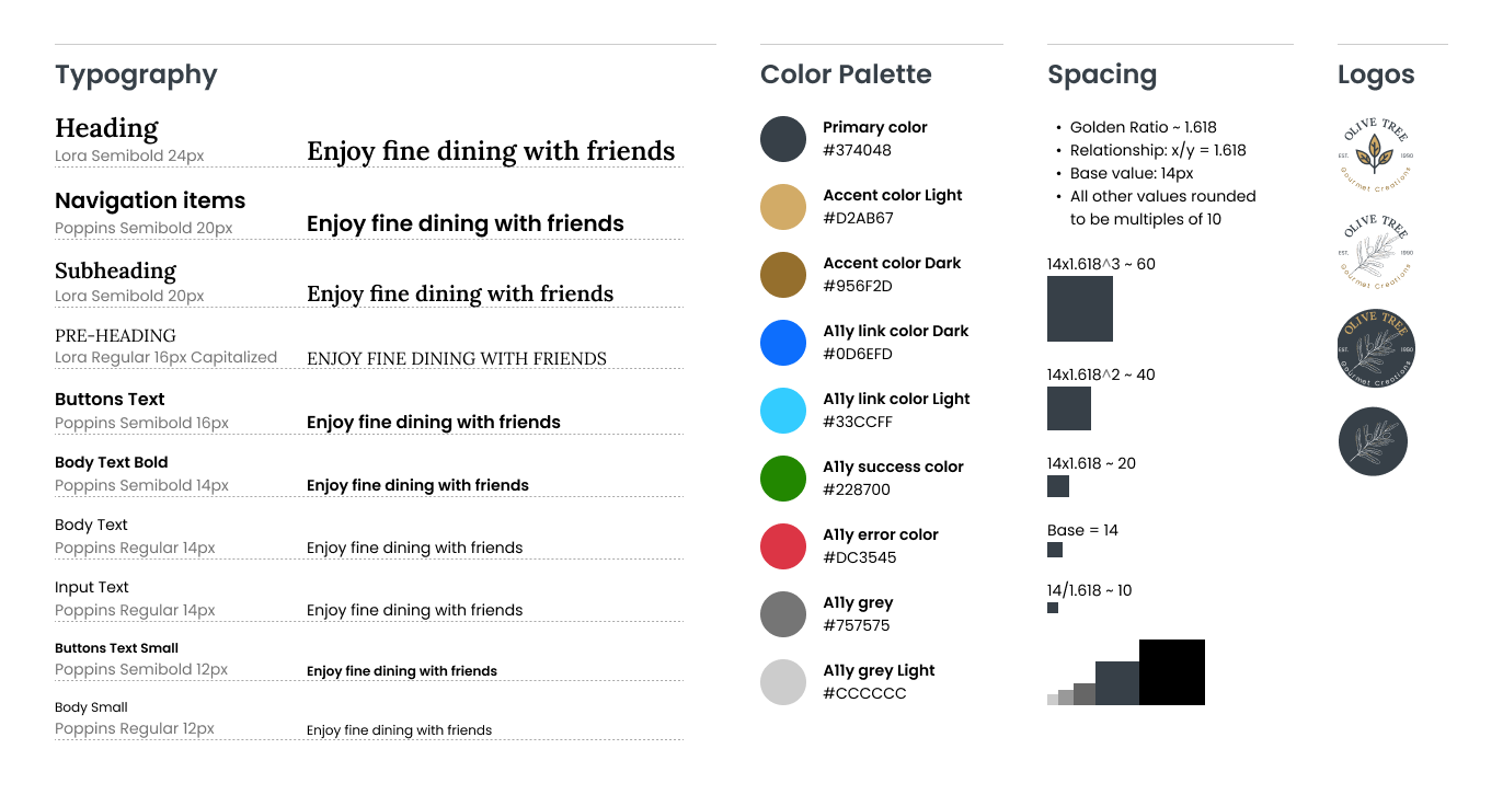
Using accents of silver and gold to create the primary color palette for Olive Tree, came from wanting to communicate to users the character of the gourmet restaurant, which combines elegance & luxury to provide patrons a fine-dining culinary experience.
Accessibility considerations were addressed, by making sure all color contrasts follow the "Web Content Accessibility Guidelines" (WCAG).
The brand guidelines are also expressed in the typography, using an elegant serif typeface for headings, and a sans-serif typeface for the body text for a "clean" look & optimized legibility.
Takeaways
Impact
The web app makes users feel like the Olive Tree restaurant really thinks about how to address their actual needs.
One quote from user feedback:
"I really like the whole idea of the app, it's original & I haven't seen one around. I feel safer since I have proof my allergy concerns will be addressed by the restaurant"
What I learned
While designing the Olive Tree restaurant's web app, I realised the initial ideas for the web app where only a fraction of the process. Competitive audits, usability studies & the valuable feedback users & peers provided were crucial for each iteration of the web app's design.
You can have an overview of the creation process for the Olive Tree web app by downloading the file below!
